01 / Brand identity
Heni
Services
Brand strategy
Hand-lettered logo and symbol
Visual identity
Applications
Credits
Art direction
Mateus Franzé
Design
Mateus Belchior
Industry & place
Açaí producer
Belém do Pará, Brazil
Overview
Original açaí, from the North of Brazil.
Heni is a regional açaí producer that takes the original fruit of the Brazilian North to the rest of the country, keeping what matters most about it: the origin, the flavor and the tradition.
The brief was a balance. Use the codes people already link to açaí, so the category reads at a glance, and still stand apart on a shelf full of look-alike labels. The goal was a brand people want, not just one they recognize.
Concept
Organic, energetic, made in Belém.
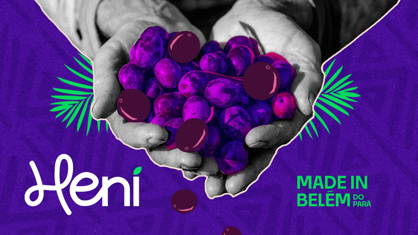
Every choice was aimed at something organic and fluid. The symbol is the first letter of the name, an H drawn only for Heni, and the whole logotype is lettered by hand: a nod to the past that still speaks to the present, like the açaí itself, passed from hand to hand from the palm tree to the bowl.
The personality came before any drawing: organic, energetic and emotional at the core. The voice is young, casual and a little irreverent, for a popular product that has to talk to younger buyers too.
Visual system
Blue, where everyone else is purple.
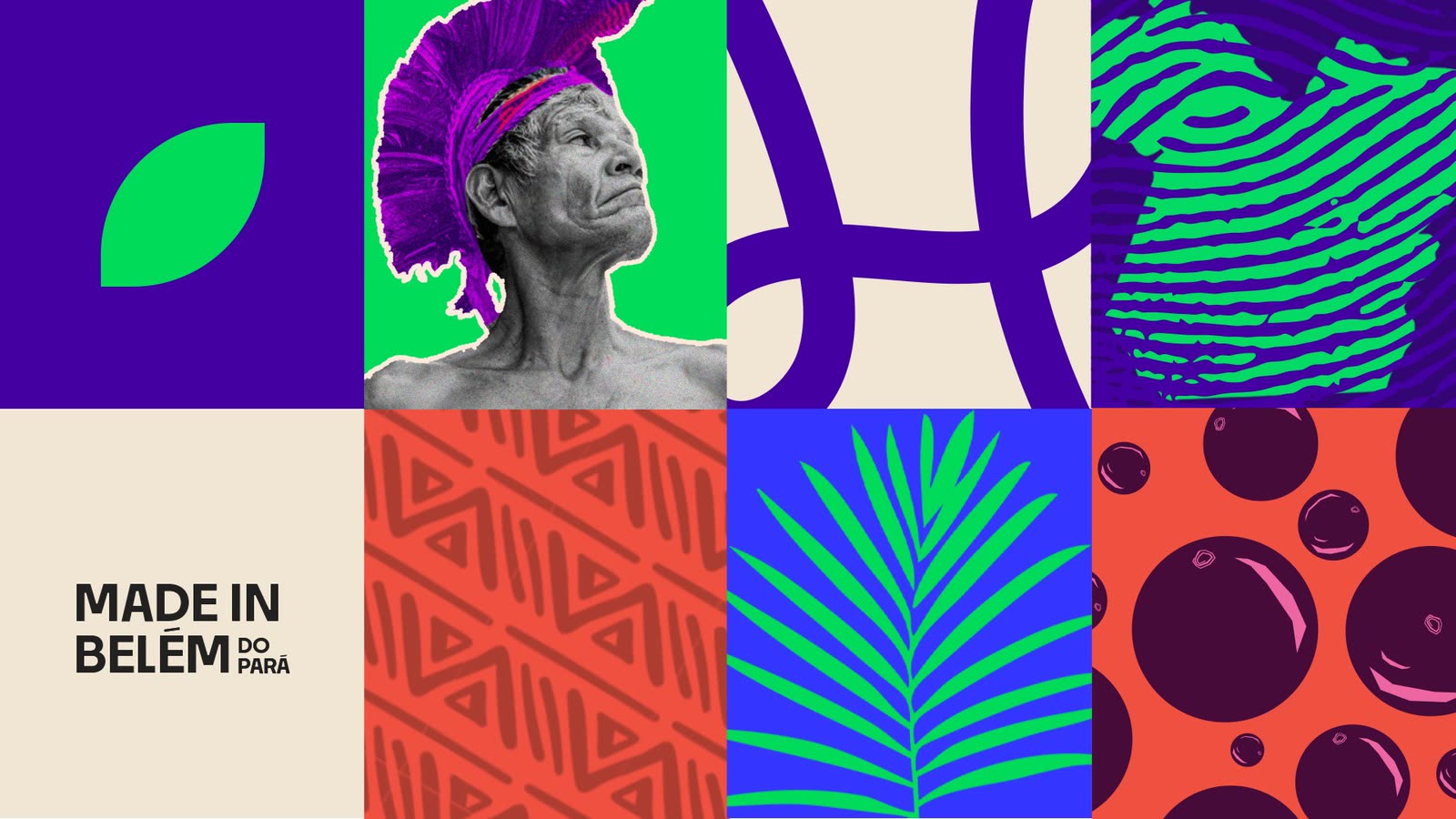
Royal blue leads the palette, taken from the flag of Belém. Another purple label would have been the easy choice, and the usual one. Purple stays as a complement, so the product still speaks the language of açaí while standing apart from competitors that all look alike.
RGB 52 53 255
RGB 60 1 155
RGB 4 219 100
RGB 237 228 211
RGB 22 22 22
Logo and symbol
One letter, drawn by hand.
The logo works on every color of the palette, and the H stands alone where the name does not fit, like an app icon or a seal. The supporting texture is drawn from the cultural patterns of Pará.

Applications
From the palm tree to the bowl.
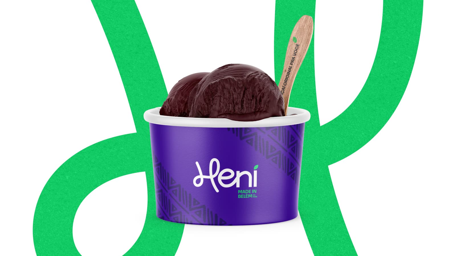
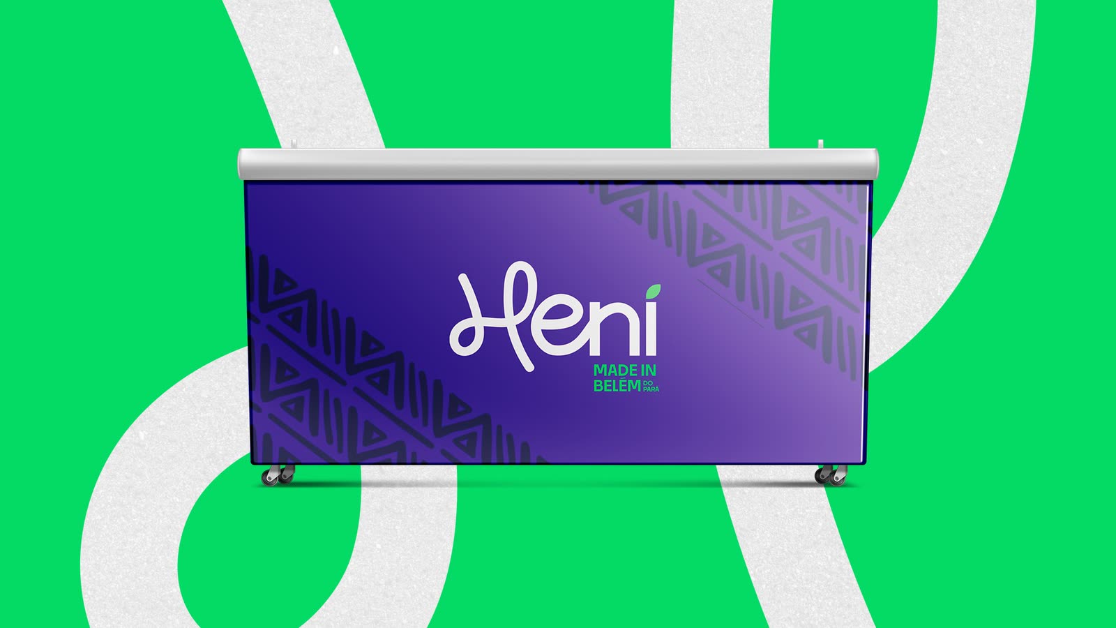
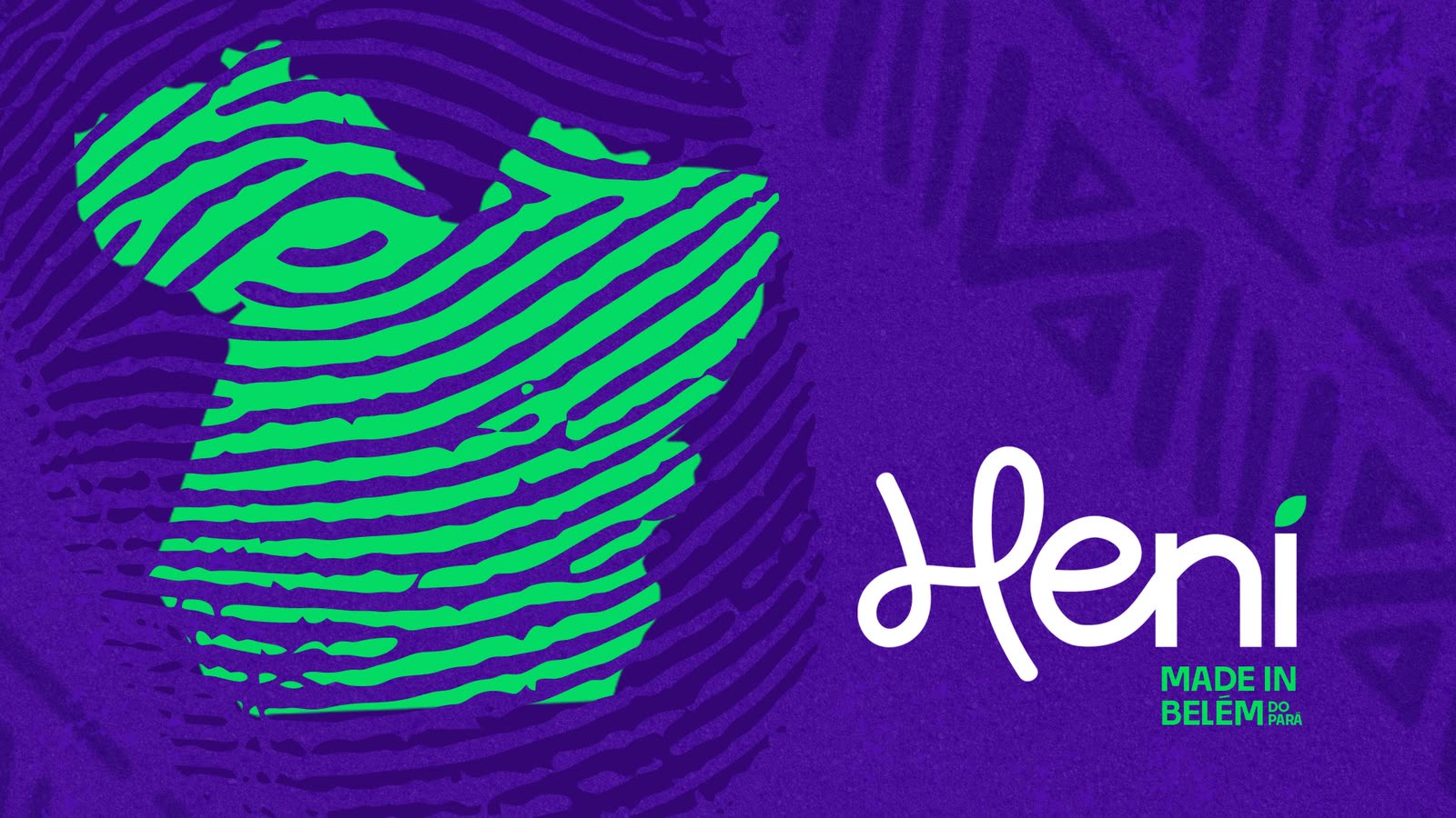
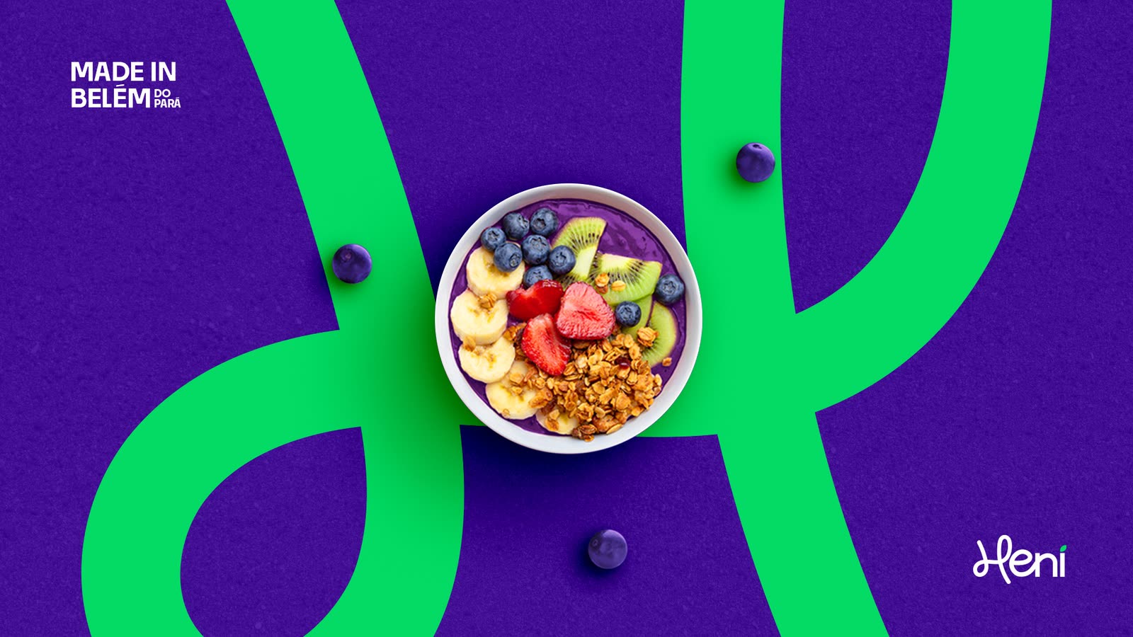
Original açaí, made for you.
Heni · Made in Belém do ParáResult
A brand that carries the North in every bowl.
Want a brand like this for your business?
Get a quote for your brand