02 / Brand identity
JPB
Services
Strategy
Visual identity
Art direction
Applications & signage
Direction
Mateus Franzé
Industry & year
Construction
Brazil · 2025
Overview
A brand for the people who build.
JPB is a construction and real estate company that delivers more than square footage: it delivers new moments. The challenge was to turn solidity, trust and a vision of the future into an identity that is just as strong on the job site as at a launch.
The answer was an engineered brand: robust, contemporary and instantly recognizable, from a worker's hard hat to the billboard of a new development.
Concept
As solid as what it builds.
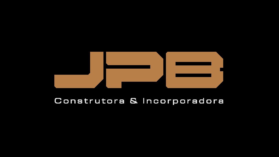
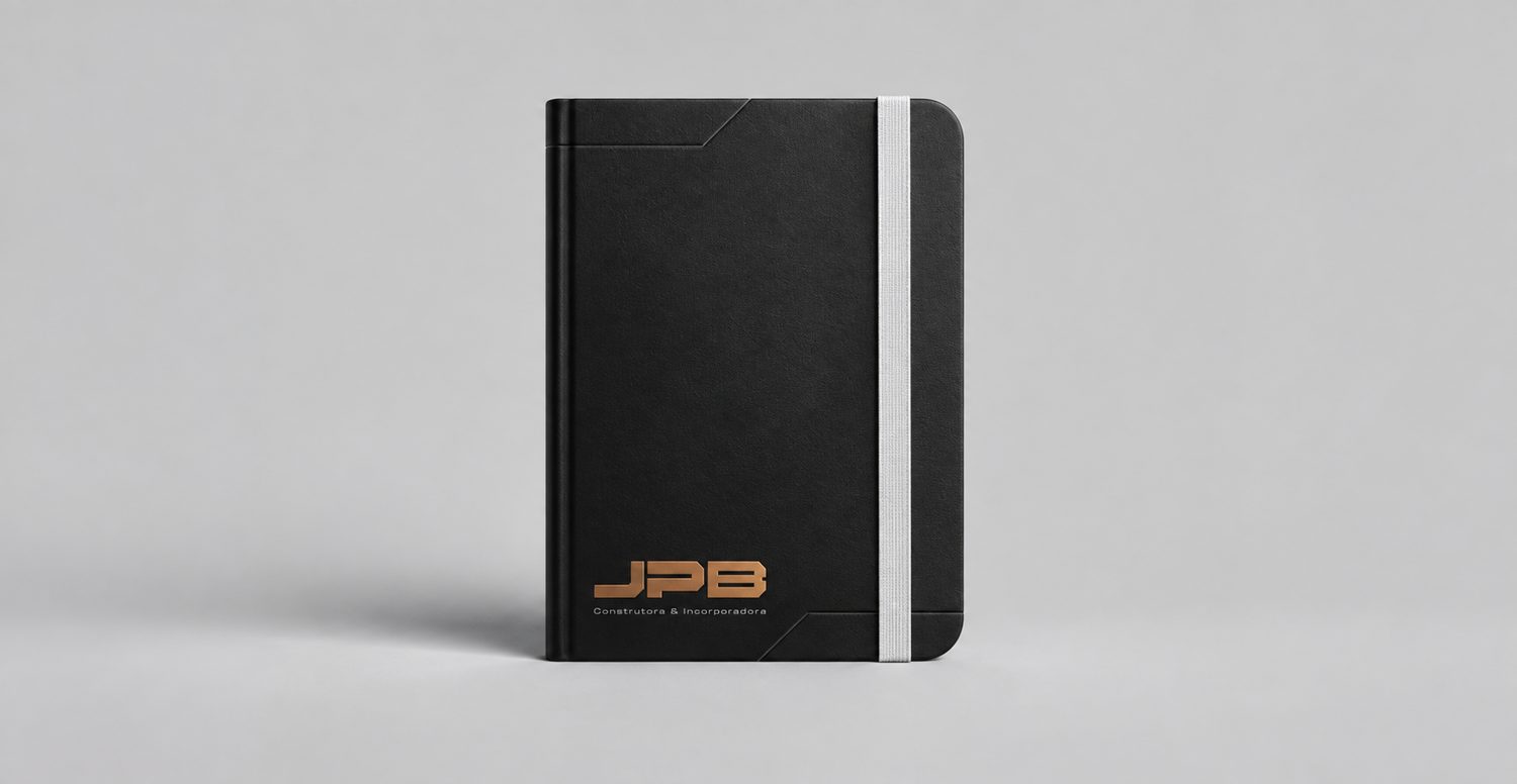
The logo comes from typographic engineering: solid blocks, precise angles and calculated gaps. A mark with structural weight that holds up at any scale.
Copper brings warmth, value and the tone of metal; petrol graphite brings authority and depth. Together they make a contemporary pair, far from the construction orange cliché.
Visual system
An identity built to last.
RGB 185 127 72
RGB 230 230 230
RGB 13 13 13
RGB 30 37 38
Applications
The brand in the field.
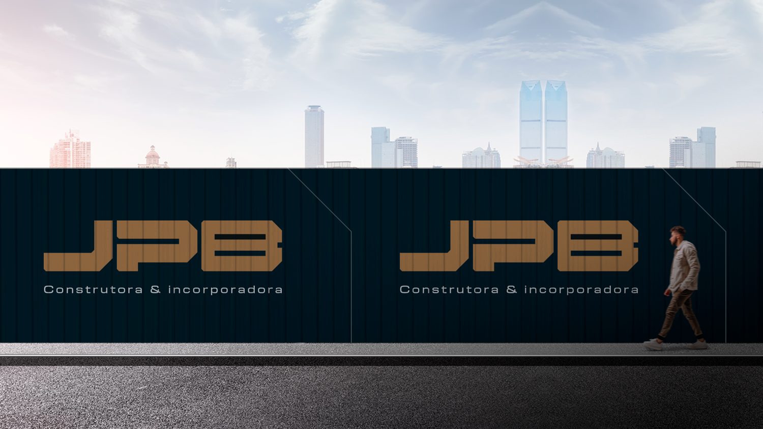
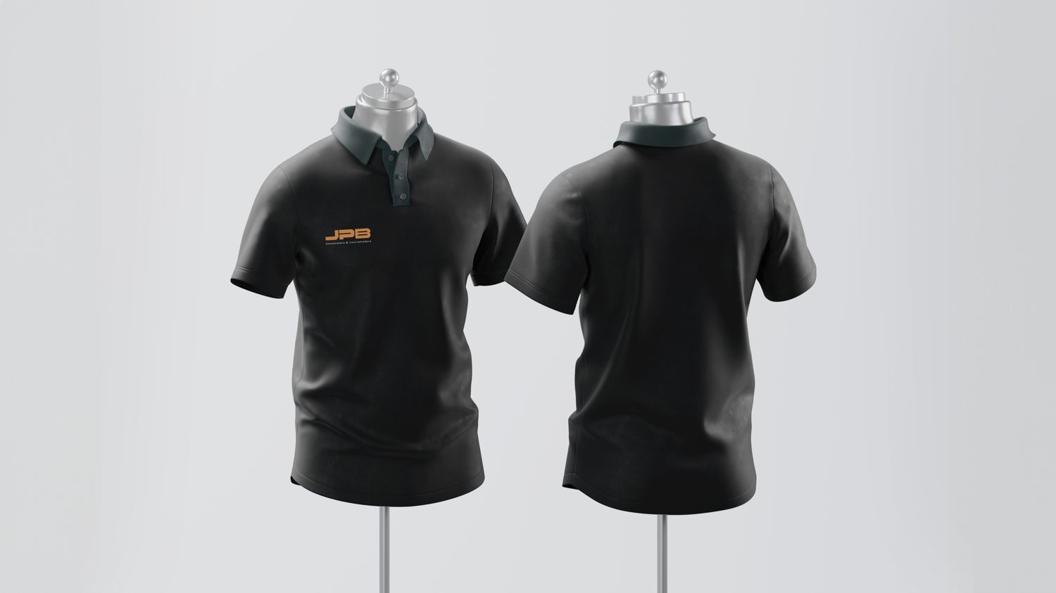
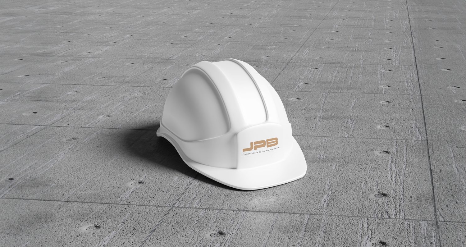
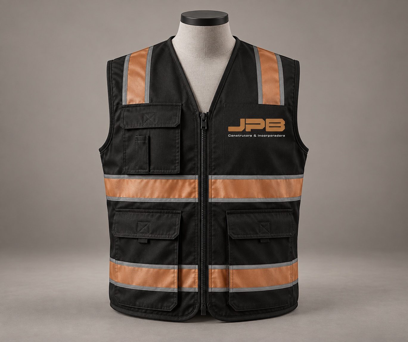
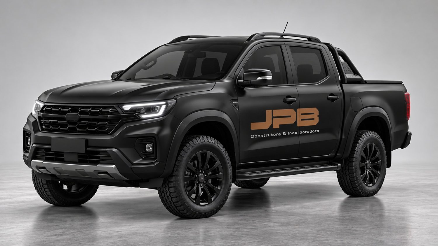
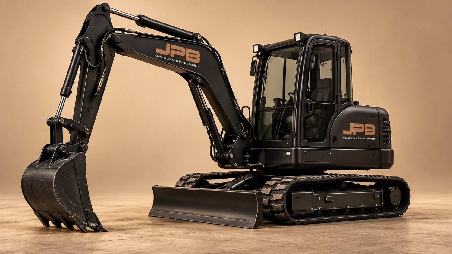
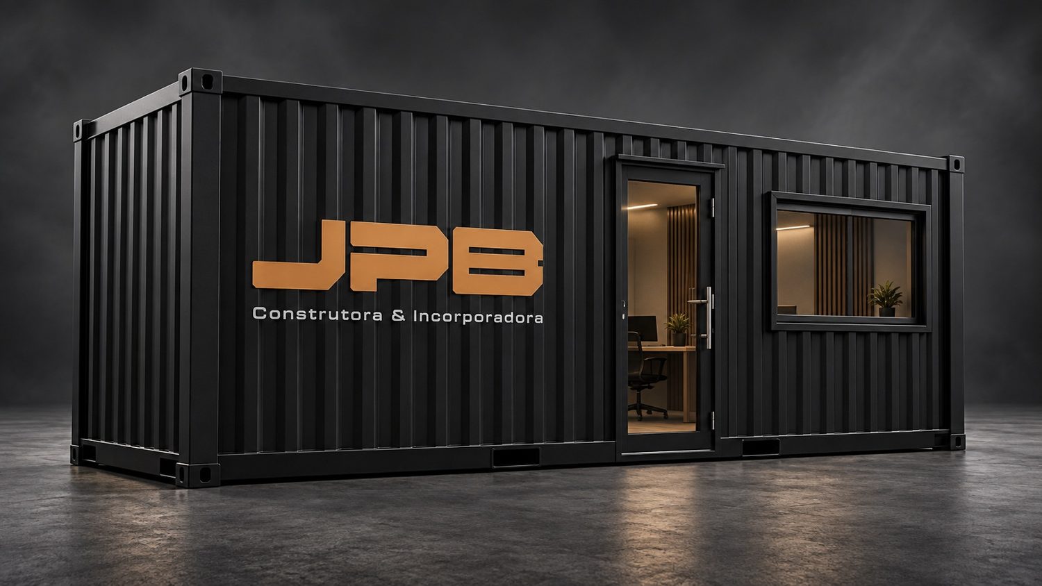
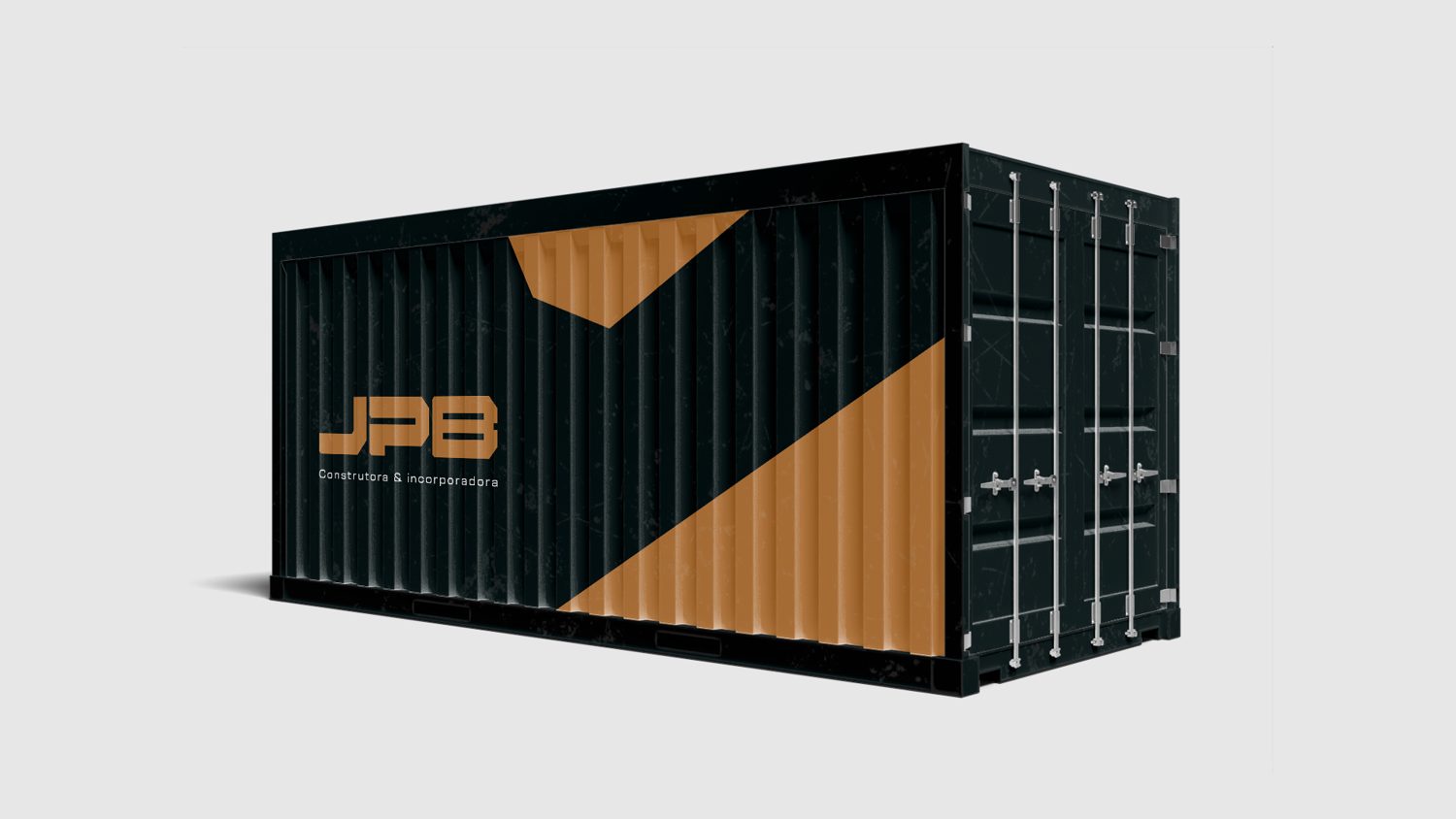
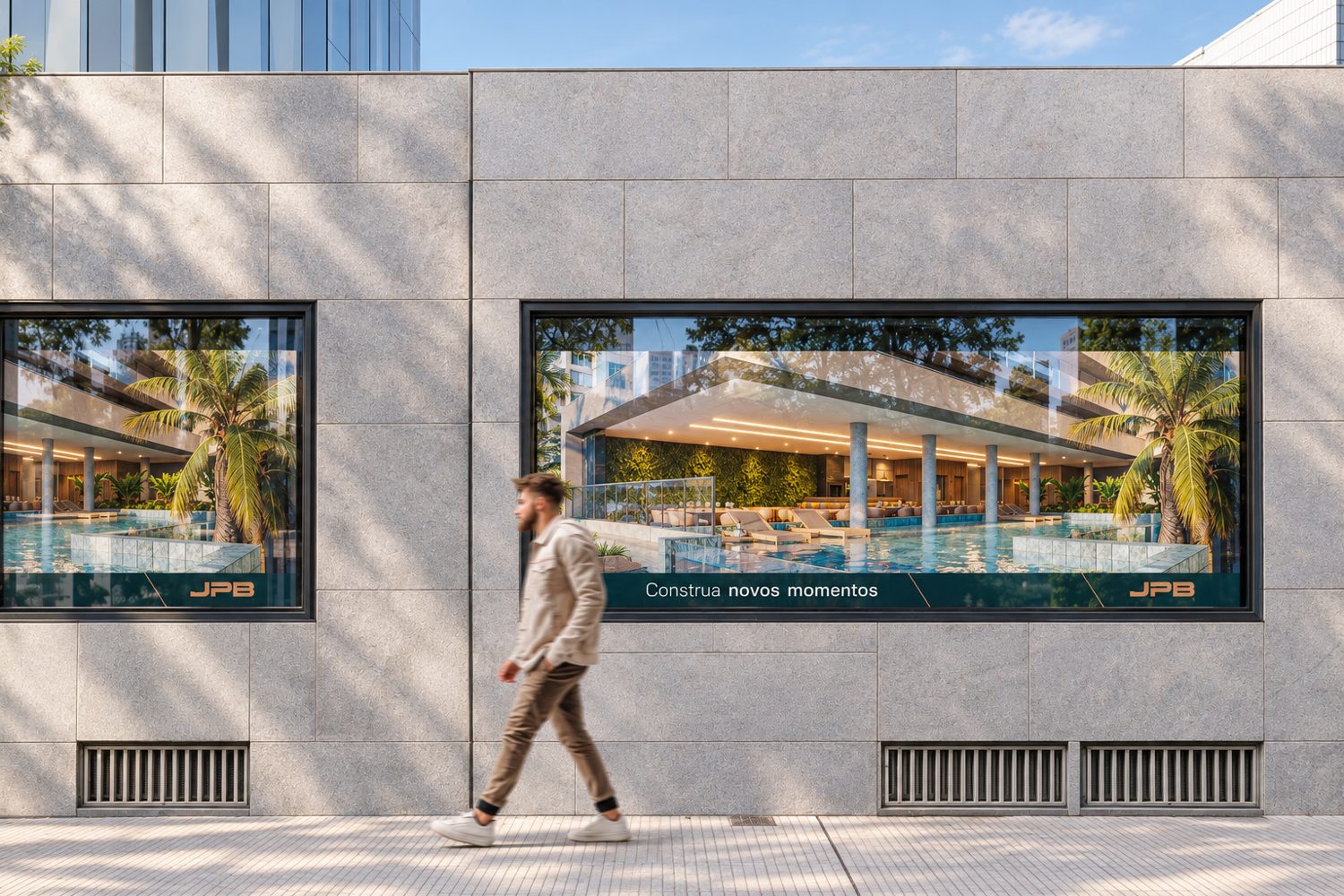
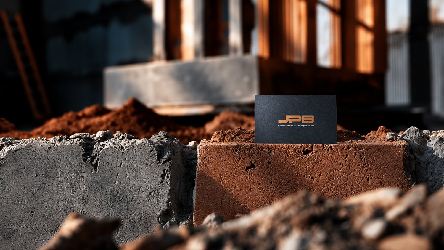
From the job site to the launch.
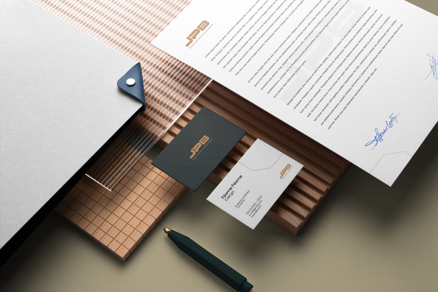
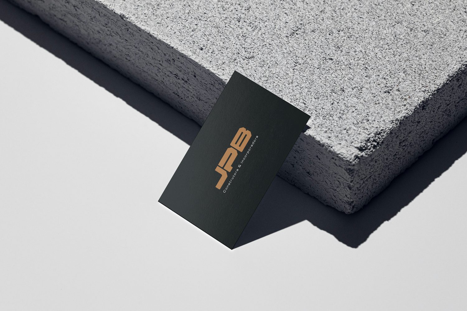
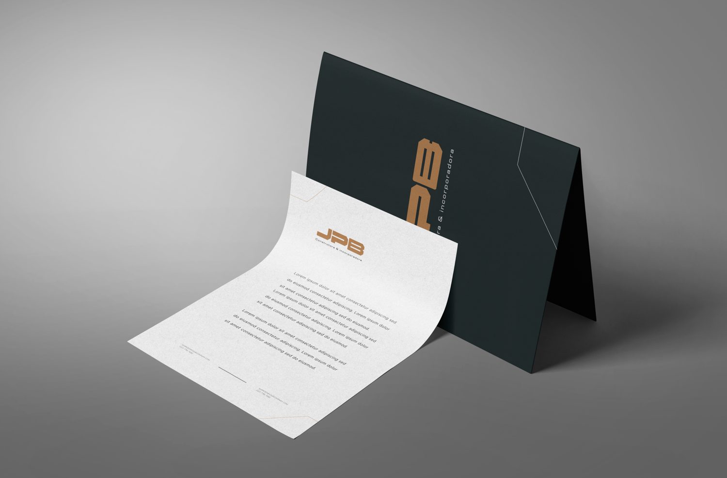
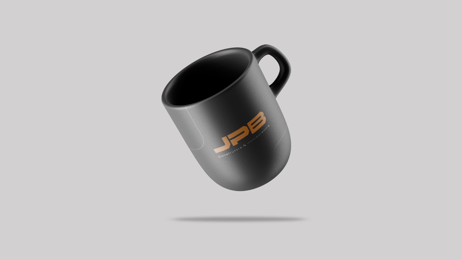
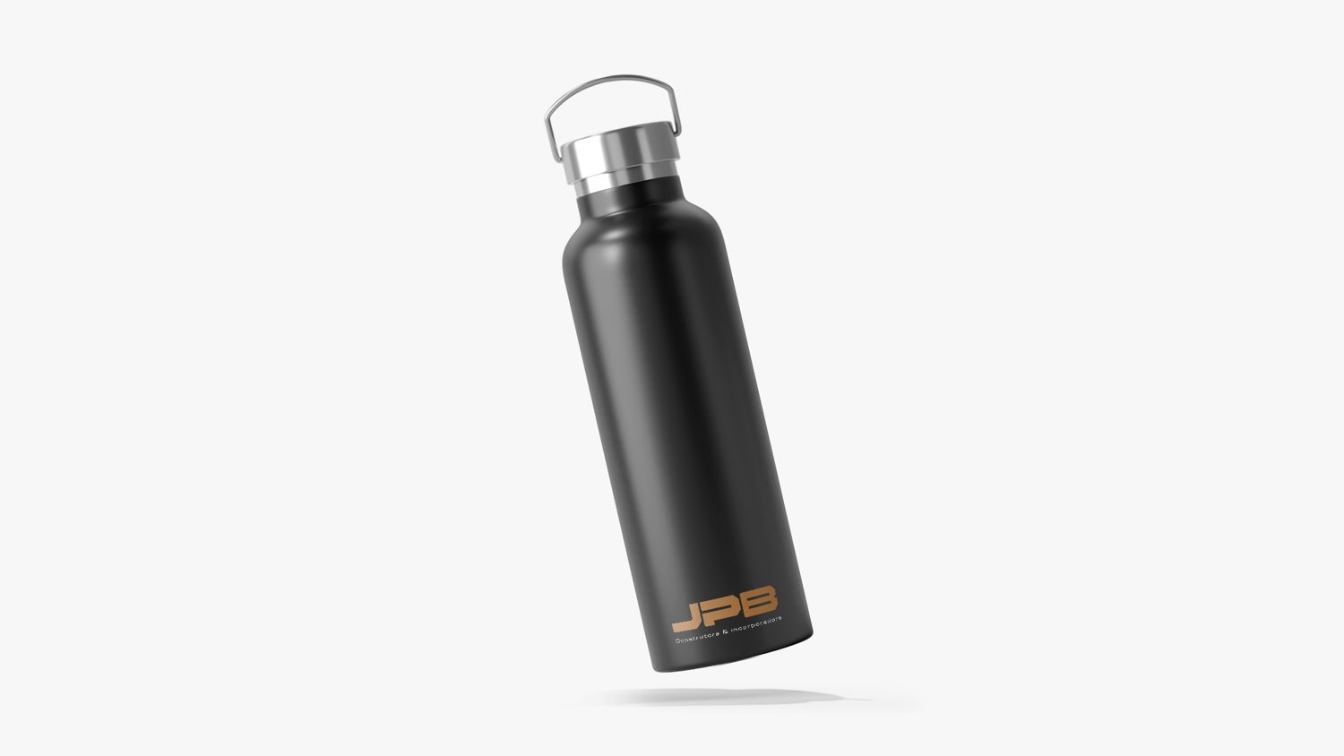
JPB · Construtora & IncorporadoraPrint & merchandise
The brand beyond the build.
Result
A brand with structural weight, ready for the job site, the city and the next launch.
Want a brand like this for your business?
Get a quote for your brand