Instituto / Brand identity
STIMA
Services
Brand strategy
Logotype and symbol
Visual identity
Applications
Credits
Art direction
Mateus Franzé
Design
Mateus Belchior
Industry & place
Dental clinic
Brazil
Overview
A clinic that changes how people smile.
Instituto STIMA is a dental clinic focused on oral health, caring for patients for more than 16 years with humane, excellent service. In its own words, the work is about transforming self-esteem through oral health.
The brief was a balance. Use the codes people expect from dentistry, so the category reads at once, and still stand apart from the other clinics in town. The goal was a brand patients want, not just one they recognize.
Concept
Your smile first.
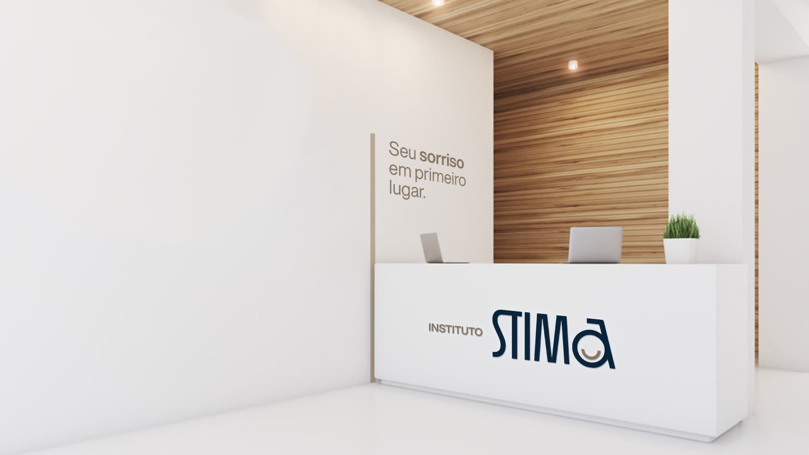
The slogan says it before anything else: Seu sorriso em primeiro lugar, your smile comes first. The whole direction aims at the feeling of care, the pillar of how the clinic treats its patients.
The personality sits between welcoming, professional and trustworthy. The voice is serious enough for healthcare and friendly enough for a waiting room, and never irreverent: it deals with people's self-esteem.
Visual system
A written logo, with a smile inside.
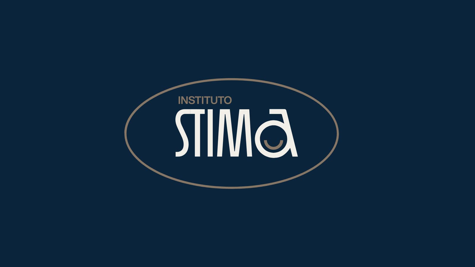
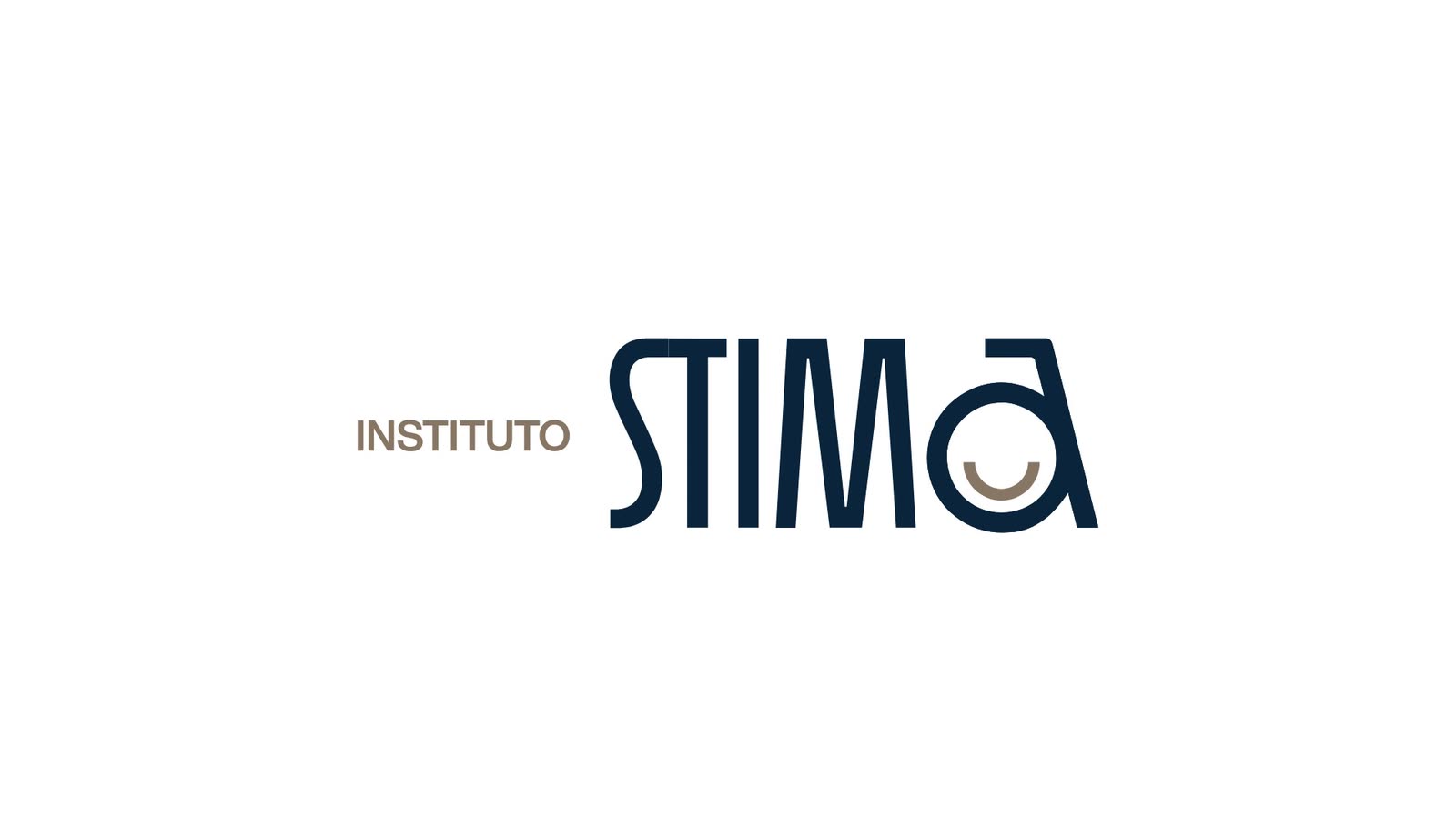
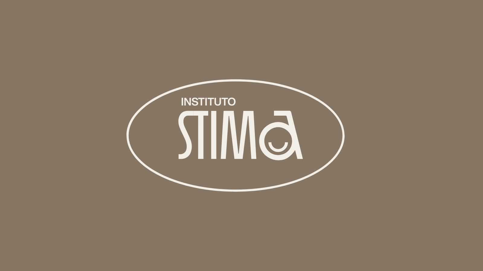
Like Coca-Cola, Disney or Zara, the clinic got a written logotype instead of an icon, for a more premium feel. Navy leads the palette and sets the tone of seriousness; every other color turns around it: earth for tradition, sand for warmth, linen for affection. Headlines are set in Helvetica Now Display, clear at any size.
RGB 10 36 59
RGB 135 118 100
RGB 209 194 171
RGB 242 239 232
Logo and symbol
The a that smiles.
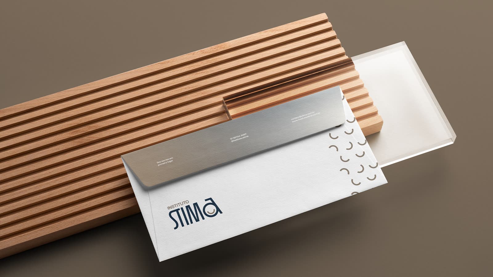
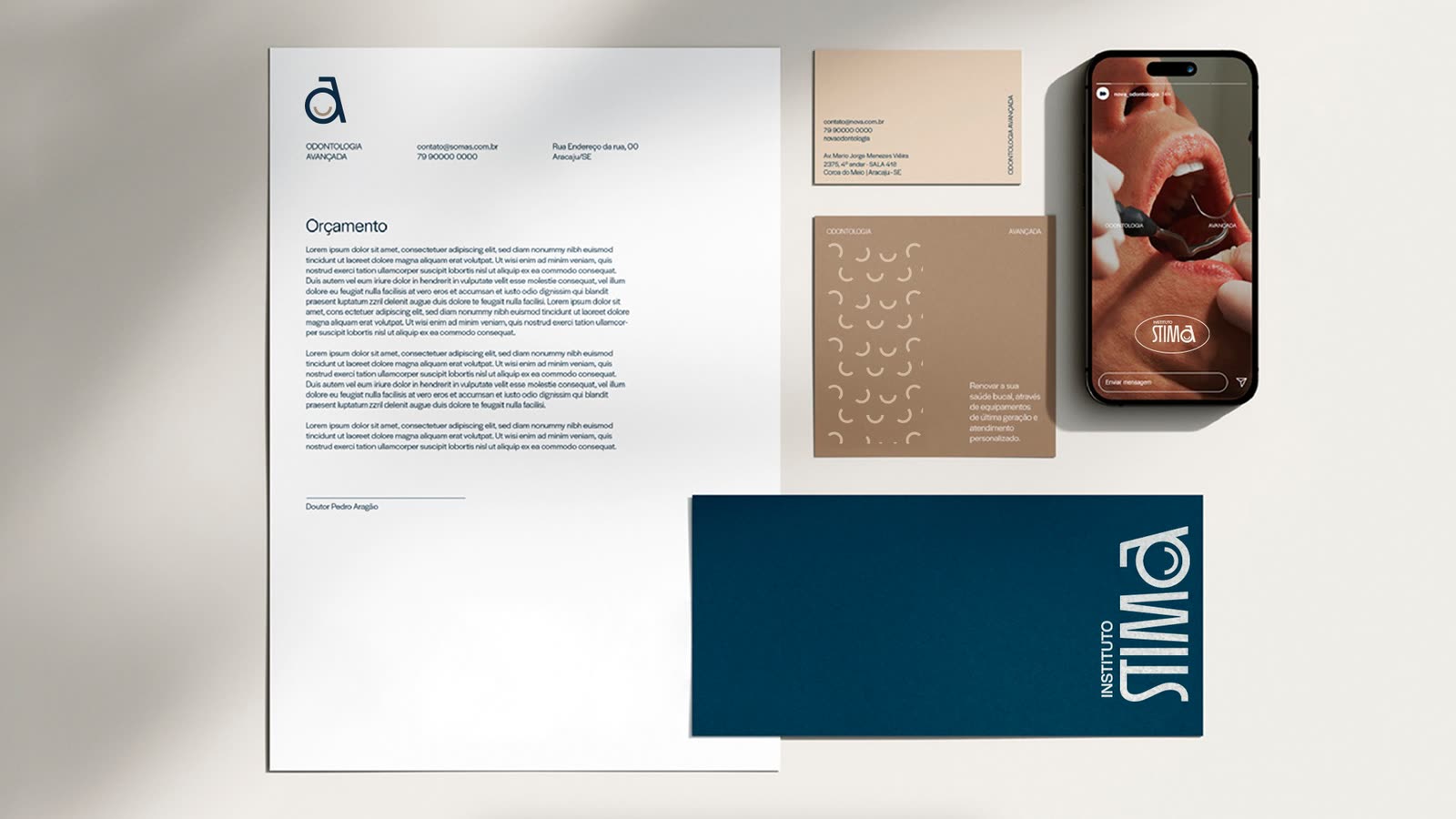
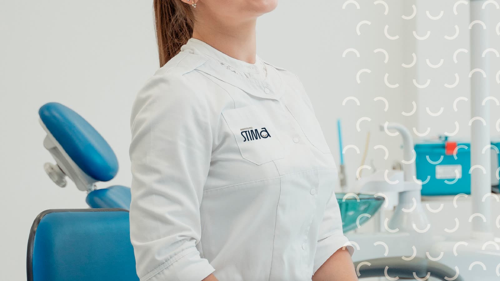
The a of the logo carries a smile, and works alone where the full name does not fit, like an app icon or the chest of a uniform. The supporting texture is drawn from that same smile.


Applications
From the chair to the feed.



Your smile comes first.
Instituto STIMAResult
A brand as careful as the care behind it.
Want a brand like this for your business?
Get a quote for your brand