What to put on a landing page for a service business
A service is harder to sell online than a product: there is nothing to hold, and the buyer is really buying trust in you. The page has to earn that trust in the order the visitor needs it. These are the sections that do it.

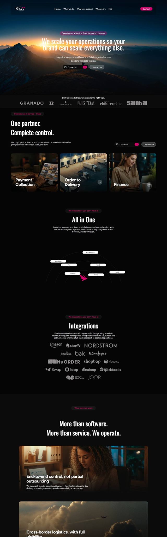
The order matters as much as the content. Each section answers the question the visitor has at that exact point of the scroll. Answer them out of order, and people leave with the question still open.
1. A headline that says what you do, for whom
The first screen has one job: make the right person think "this is for me". Say what you do and who it is for, in plain words. Clever lines that need a second read lose people who are skimming, and almost everyone arriving from an ad is skimming.
Under the headline, one sentence with the result the client gets, and one button. Nothing else competes for attention up there.
2. Proof, early
The second question in the visitor's head is "can I trust them?". Answer it before you start explaining. Client logos, a number that means something, a short testimonial with a real name and a face. Proof that comes at the bottom of the page arrives after most people have already decided.
3. The problem, in the customer's words
Describe the situation your client is in before they hire you, using the words they use. Not the words of your industry. The best source is not your imagination, it is reviews, emails and sales calls: how people describe the pain when they first reach out. When a visitor reads their own sentence on your page, you have their attention for the rest of it.
4. How it works
Services feel risky because they are invisible. Make the process visible: three to five steps, what happens in each, and how long each takes. A simple timeline removes one of the biggest fears in hiring someone, which is not knowing what happens after paying.
5. What is included, and the price
Many service businesses hide the price and ask people to "get in touch". For high ticket, fully custom work that can be right. For most services, showing at least a range filters out the wrong leads and reassures the right ones. If you have packages, show them side by side with what each includes, and make the middle one the obvious choice.
6. The objections, answered before they are asked
Every service has the same handful of doubts that stop people: how long does it take, what if I do not like it, what exactly am I paying for, what happens if something goes wrong. Write them down and answer each one honestly in a short FAQ. A doubt that goes unanswered does not disappear; the visitor just closes the tab.
7. One action, repeated
Pick one thing you want the visitor to do, like request a quote or book a call, and repeat that same button after every major section. Offering three different actions splits the decision and lowers all three.
Then make the action itself easy. A form with fifteen fields asks for effort before giving anything back. Ask only what you need to reply, and if you can, give something back right away, like a price range.
What to leave out
Already have a page that is not working? See the landing page mistakes that quietly kill conversions.
- The main menu. Every link to another page is an exit.
- Your company history on the first screen. It belongs further down, if at all.
- Every service you offer. One page, one offer. The others get their own pages.
- Stock photos that could belong to anyone. Real photos of you, your team or your work build more trust, even when they are less polished.
A quick test: show the page to someone who fits your customer profile for ten seconds, then ask what you sell, who it is for and what they should do next. If they cannot answer all three, the first screen needs work before anything else.
A note on design
Design is what makes all of the above feel trustworthy. The same words look like a scam in a messy template and like an established business on a page with a clear hierarchy and your own brand. That is why I write the copy before designing anything: the structure comes from what needs to be said, and the design gives it the right weight.
Brand and landing page designer in Brazil, working US hours. More than ten years and over a hundred clients. I do the research, the copy, the design and the build, and the person you talk to is the person doing the work.
See my work