Course sales page examples: what the ones that sell have in common
The famous course sales pages look nothing alike. One is a wall of text, another is mostly a video, another hides the price. What they share is not the style. It is the order in which they answer the buyer's questions.

If you are looking at course sales page examples before you build or redo yours, here is the short version. The online course sales pages that sell answer five questions, in this order: what changes for me, is this for me, why should I trust you, what exactly do I get, and what does it cost. The design, the length and the tactics vary a lot. The order barely changes.
So my advice, and I will defend it for the rest of this article: copy the order, never the length. The long pages you admire are long because of who reads them, and that part does not come with the template.
What the best course sales pages have in common
Thrive Themes did a useful teardown of six high-priced course sales pages, from Copyhackers, Marie Forleo, Backlinko, Ramit Sethi and others. The pages share a handful of parts: modules shown in boxes, an "about the instructor" section, a lot of testimonials, and a money-back guarantee that most often sits right after the price. I checked the live pages of two of them this month, and the pattern still holds.
Reduced to what a buyer needs, the common parts are these:
- A promise in the student's words. What changes after the course, not what the course contains.
- A clear "this is for you if". The reader has to recognize themselves before they care about modules.
- Specific proof. Names, numbers and results from real students. "Life-changing!" convinces nobody.
- The inside of the course. Modules, format and what you get on day one.
- The price with its context. What is included, how to pay and the guarantee, close together.
Try this today. Open your page and write, next to each section, which of the five questions it answers. A section that answers none is a section to cut.
Example 1: B-School answers "is this for me?" out loud
Marie Forleo's B-School page is a good lesson in proof. It opens with a plain name and a one-line promise, and the first proof is a number, over 80,000 entrepreneurs, according to the page. Then come student stories with specific results, a list of outcomes, and only later the teacher, with her books and media logos.
The part worth stealing is the section that asks, in so many words, whether B-School is right for you. It splits the audience into beginners, established offline businesses and experienced owners, and talks to each one. That is the "is this for me?" question answered in a heading, where a scanning reader will see it.
The part I would not copy: when I checked in October 2026, the page did not show the price, and every button had different words ("Join B-School", "I'm Ready, Marie!", "Get B-School Now"). With her audience, that works. With cold traffic from an ad, a hidden price sends people away to guess, and five button labels make five decisions out of one.
Example 2: Copy School keeps the headline short and the proof specific
Copy School, from Joanna Wiebe, opens with seven words: "Be the real deal. With Copy School." The button right under it says "Join now" and jumps to the pricing table. No mystery about what to do.
The proof is where the page earns its keep. Instead of praise, the testimonials carry the student's name and a concrete result, like a first month at a certain income. Specific proof from a named person reads as a fact. Vague praise reads as decoration. If your students have told you what changed for them, ask them if you can use their name and that one result. One specific testimonial does more than ten "great course!" quotes.
Why you should not copy the length
The Thrive Themes teardown estimated the Zero To Launch page at around 17,000 words, by their own count. People see that and conclude that long pages sell. I think that reads the example backwards. Those pages are read by people who have followed the creator for years, through emails and books. They arrive warm and they want detail.
Your reader, if they came from an ad, does not know you yet. And most people do not read a page at all: in the Nielsen Norman Group's research, 79 percent of test users scanned every new page and only 16 percent read word by word. So the length you need is the length that answers your buyer's real questions, with headings that work on their own for the person who only scans.
A good test is to read only the headings of your page, top to bottom. If they alone tell the buyer what changes, for whom, why trust you, what is inside and the price, the page works for scanners.
Example 3: Questão de Ordem, a page I designed
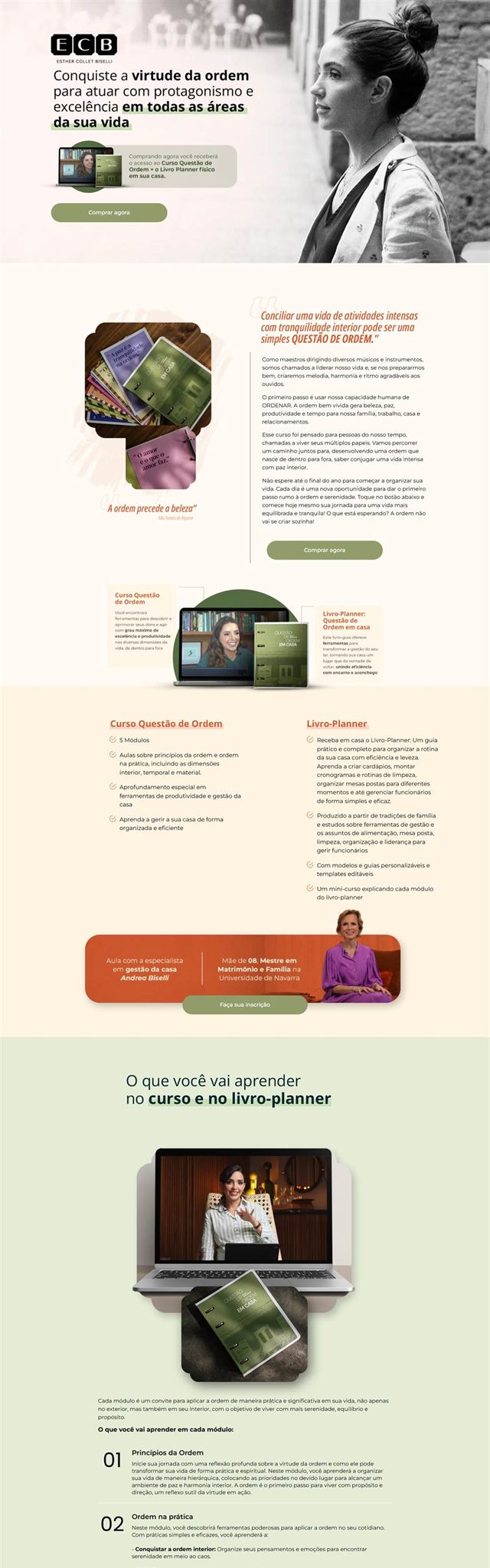
The cover of this article is the sales page I designed for Questão de Ordem, a course and planner book about order and running a home. It is a long page, and every part of it follows the order above.
- The promise, then the reason. The opening says what the course is for, then moves straight into why order matters, in the author's voice.
- The offer next to the first button. Right beside "buy now" there is one line saying what you receive: access to the course and the printed planner at home. Two products, read as one decision.
- The inside, module by module, under one quiet heading.
- Price, then proof, then the guarantee. The offer, reader reviews and a 7-day guarantee, in that order, so the number never stands alone.
- The author and the questions people ask before buying, at the end, for whoever is still deciding.
On the phone the order stays the same, and the button is always a thumb away. What the page does not have matters as much: no countdown that resets, no fake "three spots left". The genre loves that kind of shouting. I left it out because the course is about calm and order, and a page that shouts would contradict the product.
The order is not sacred, though. On G7 Jurídico, a study club for lawyers, I put proof before the price and names before the proof, because that audience buys on authority. You can see both projects, and how I build these pages, on the course sales page service.
How to use sales page examples without copying them
Here is the exercise I would do before redesigning anything. It takes about 20 minutes.
- Pick three sales pages from creators in your niche, at a price close to yours.
- For each one, write down the headings in order, as a plain list.
- Next to each heading, write the buyer question it answers.
- Do the same with your page.
You will usually find one of two problems. Either your page answers a question too late (the price shows up before anyone knows what is inside), or it never answers one at all (nobody says who the course is not for). Fix that first. Colors and fonts come after. If you are still deciding whether the page should live on your own site or on the course platform, read how to sell an online course from your own website first.
Common questions about course sales pages
How long should a course sales page be?
As long as it takes to answer the buyer's real questions, and no longer. A cheap course for a warm email list can sell with a short page. An expensive program sold to cold ad traffic needs more proof and more detail. Length follows the questions, not a template.
Should I show the price on my course sales page?
For a course people buy on the page, yes. Hiding the price sends people away to guess, and many do not come back. Show it next to what is included, how to pay and the guarantee, so the number never appears alone. Programs sold on a call are the exception.
Do I need a video on my course sales page?
No. A video helps when you are the product and people need to hear you before they trust you. But most visitors scan, so the page has to sell without it. Write the page first, then add a video that says the same thing in your voice.
What to do this week
Do the 20-minute exercise with three pages from your niche. Then rewrite only your headings so that, read alone, they answer the five questions in order. That single change often tells you whether your page needs a fix or a full redesign.
Brand and landing page designer in Brazil, working US hours. More than ten years and over a hundred clients. I do the research, the copy, the design and the build, and the person you talk to is the person doing the work.
See my work