Do you need a new logo? Signs your brand is holding you back
Most people who think they need a new logo don't. They need the logo they have to work better, in more places. Here is how to tell the difference before you pay for a rebrand.

Do you need a new logo? Only if your business changed or your logo breaks where people see it. Rebranding a logo makes sense when you now sell something different, to someone different, or under a new name, or when the logo falls apart at small sizes and in one color. Being tired of it is not a reason.
Here is the opinion I will defend in this article: a logo people already recognize is an asset, and you should change as little as you can get away with. Most of the time the fix is a refresh plus a system around the logo, not a new mark.
Signs you really need a new logo
These are the five that justify the money. If none of them fits, skip to the next section before you call a designer.
- You sell something different now. You started as a yoga teacher and now run a certification program for other teachers. A logo made for a weekend class can look small next to a US$ 2,000 program.
- You changed your name. Obvious, but it is the cleanest case. The old logo literally says the wrong thing.
- It breaks where you actually use it. It turns into a smudge as a profile picture, disappears in one color, or has thin lines that vanish on a phone. This one is a real problem, and it is often fixable without starting over.
- It looks like everyone else in your niche. Marty Neumeier writes in The Brand Gap that "we're hardwired to notice only what's different". If your mark could swap places with three competitors and nobody would notice, it is not doing its job.
- You avoid using it. You leave it off the slide, crop it out of the post, or apologize for it on calls. A designer quoted by the Association of Registered Graphic Designers lists that same hesitation, a team that no longer wants to use its logo, as a sign it is time.
Try this today: write down which of the five applies to you, in one sentence. If you can't write the sentence, you probably don't need a new logo.
Signs you don't (even if it feels like you do)
These are the reasons I would talk you out of a rebrand.
- You are bored of it. You see your logo a hundred times a day. Your audience sees it a few times a month and is only starting to remember it.
- A launch didn't sell. When a course launch is weak, the usual suspects are the offer, the audience and the sales page, long before the logo. Look at the landing page mistakes that quietly kill conversions first.
- A competitor just rebranded. That is their reason, not yours.
- You want to follow a trend. Whatever is fashionable this year will date your logo to this year.
The famous warning here is Gap. In October 2010 it replaced its blue box logo with a new one, and after a wave of complaints it went back to the old one about six days later. People were attached to something the company was ready to throw away.
Refresh, redesign or rebrand: three sizes of change
"New logo" can mean very different jobs. Name the size before you ask for quotes.
- Refresh. Same idea, better drawing. Cleaner shapes, better spacing, a version that works small. Your audience barely notices, and that is the point.
- Redesign. A new logo, but it keeps what people already link to you: the color, the initial, the shape.
- Rebrand. A new idea for the whole business, often with a new name, new colors and new messaging. Worth it only when the business itself changed.
Researchers at the Ehrenberg-Bass Institute, who study how people recognize brands, put it plainly when they looked at the Formula 1 logo change: "it does not need to be radically different to its predecessor." Their examples are Google, which changed its typeface but kept almost the same colors, and Subway, which kept its arrows. Years of people seeing your logo are an investment, and a dramatic change can write it off.
Before you approve a new logo, ask: what does it keep from the old one? If the answer is "nothing", be sure that is on purpose.
A ten-minute test for your current logo
You can do this today, with your phone, before you talk to anyone.
- Profile picture size. Put the logo in a small circle, like an Instagram avatar. Can you still tell what it is?
- One color. Make it all black on white, then all white on a dark photo. Does it survive both?
- Next to competitors. Put it in a row with the logos of three people who sell what you sell. Does yours stand apart, or blend in?
- On your real pages. Look at it in the header of your Kajabi or Teachable page and on a slide from your last webinar. Does it look like the same business as the price you charge?
If it fails only the first two, you need a refresh and a small version, not a rebrand. If it fails the last two, the conversation is bigger.
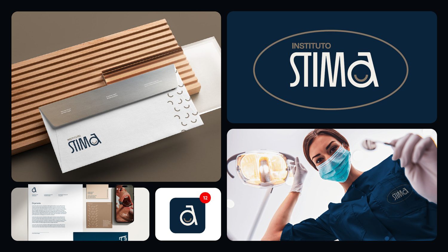
The cover of this article shows why the small version matters. It is the identity I designed for Instituto STIMA, a dental clinic. The full logo works on the envelope and the uniform, but in an app icon there is no room for the whole name. That is why the system has a small symbol, the "a" with the smile, made for the places where the full logo can't fit. You can see the whole project on the brand identity page.
What should come with a new logo
If you decide you do need one, don't buy only the mark. A logo without its versions sends you back to the first problem: it breaks in the places you use it.
In my brand identity, the concept comes first and the logo comes with its versions: horizontal, stacked, a small symbol for profile pictures, and one-color versions for dark and light backgrounds. Then the colors, the type, a guide of 10 to 20 pages and about ten templates you can edit. It is US$ 2,900, in two weeks. I wrote out what a full package should contain, and what most leave out, in what is included in a brand identity package.
Common questions about rebranding a logo
How often should a business change its logo?
There is no schedule. Change it when the business changes (what you sell, who you sell to, your name) or when the logo stops working where you use it. A logo that still fits and still works only gets more valuable with time, because people keep learning it.
What is the difference between a logo refresh and a rebrand?
A refresh keeps the idea people already recognize and fixes how it is drawn: cleaner lines, better spacing, a small version that works. A rebrand changes the idea itself, often with a new name, new colors and a new position in the market. Most small businesses need the first.
Will a new logo increase my sales?
Not by itself, and nobody honest can promise that. A new logo helps when the old one was in the way: when it looked like a different business, or broke on the places people see you. If people already trust you, the logo was rarely why sales dropped.
What to do this week
Run the ten-minute test and write your one sentence from the first list. If you have no sentence and the logo passes the test, keep it and spend the money on the page that sells. If it fails the small sizes, ask a designer for a refresh with a small symbol. If your business changed, plan a real identity, and read what a small business needs from branding in year one so you buy the parts that matter first.
Brand and landing page designer in Brazil, working US hours. More than ten years and over a hundred clients. I do the research, the copy, the design and the build, and the person you talk to is the person doing the work.
See my work