Small business branding: what you actually need in year one
You do not need a brand book or fifty templates. You need to be clearly different, and to look the same everywhere. Here is what I would set up in year one, and what to skip.

Most small businesses do not have a branding problem. They have a "what do you actually do?" problem, and a new logo does not fix that. In your first year, branding comes down to one thing: a difference people can repeat, and a look that never changes. Here is how I think about it, with a little help from a book I keep recommending.
Nobody notices what is the same
In The Brand Gap, Marty Neumeier says that we are "hardwired to notice only what's different". Read that again with your own business in mind. Your customer scrolls past ten options that all say "quality, service, results". If you say the same, you are invisible, however nice your logo is.
So the first job is not design. It is finding the one thing you do that the others near you do not, and saying it plainly. Write it as one sentence: who you help, with what, and why you instead of them. Then read it to someone outside your field. If they cannot say it back, it is not ready.
The logo comes second
Neumeier defines a brand as "a person's gut feeling" about a product, service or company. You cannot write that feeling into existence. You can only feed it, with the same few signals, over and over: how you talk, how things look, how you treat people.
That is why I am blunt with clients who ask for a logo before they have the sentence. A logo on a vague business is a nicer-looking vague business. When the sentence is clear, the design almost draws itself, because you know what it has to say.
What I would set up in year one
- The sentence. Free, and it does most of the work.
- A small identity. A logo that works on light, dark and as a tiny profile picture. Two or three colors. Two fonts.
- Three or four templates. A social post, a proposal, an email signature, a slide. When making something takes ten minutes, you actually use the brand.
- One page that says it all. Your sentence at the top, the proof under it, one way to get in touch.
That is it. In my brand projects I hand over the files and about ten ready-to-edit templates, so the brand keeps working without me. If it only works when I am in the room, I did it wrong.
What you can safely skip
A thick brand book, a tagline workshop, printed brochures nobody asked for. They are fun to make and they do not bring a customer. Add them when real work asks for them.
Where it goes wrong: the page does not match
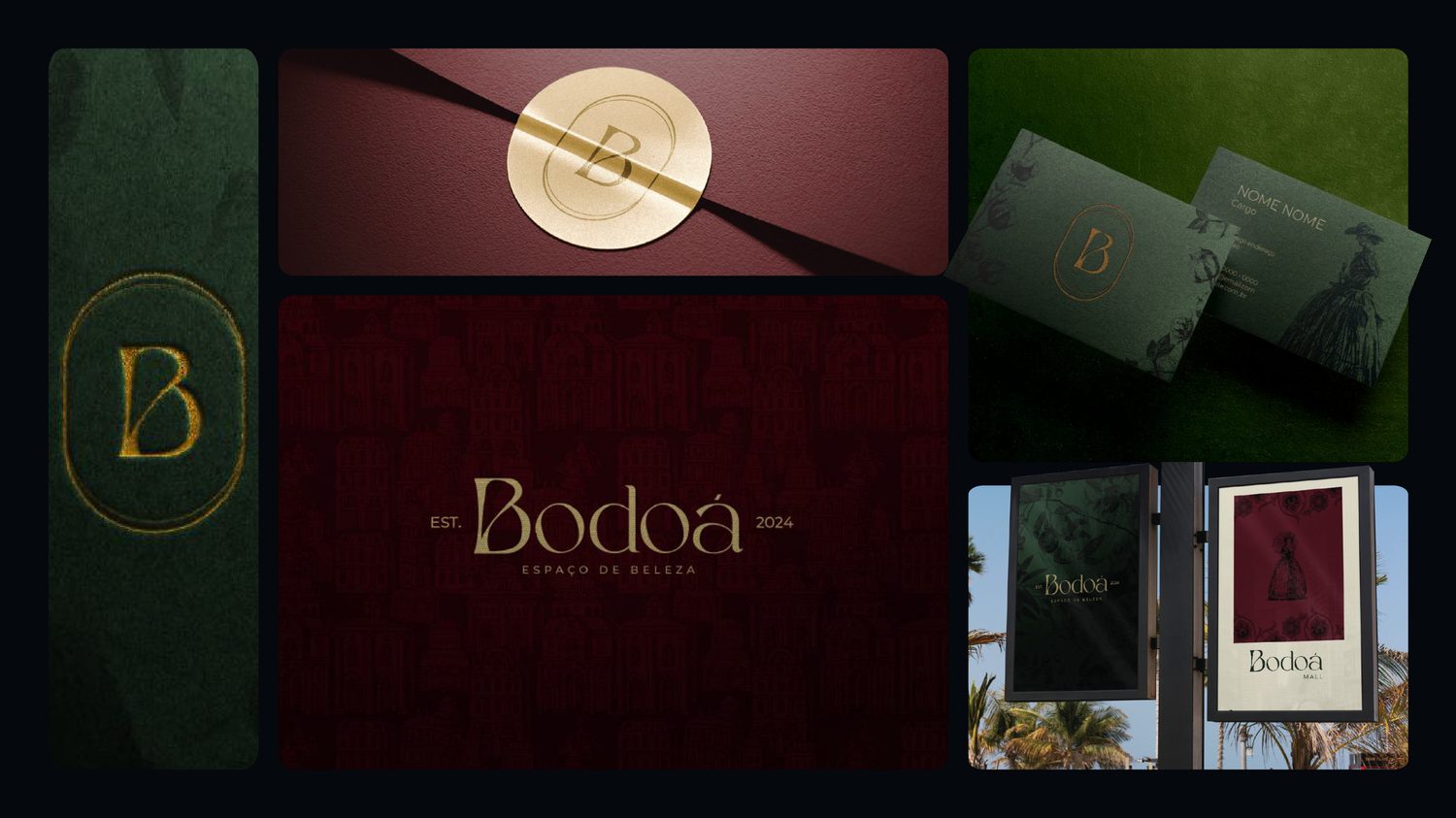
A common mistake is a sharp logo on a site that speaks in another voice. People feel the mismatch even when they cannot name it. On Bodoá I did the brand and the site together, so the page used the same colors, lettering and tone from day one. Doing both at once is the easiest way to keep them in step. If you only have the site to work on, start with what to put on a landing page for a service business.
If you cannot say what you do in one sentence, a new logo will not help. Fix the sentence first.
What to do this week
Write your sentence. Test it on two people. Then pick the template you make most often and turn it into a file you can reuse. If you want the whole identity done properly, my brand identity service is a fixed price, in two weeks.
Brand and landing page designer in Brazil, working US hours. More than ten years and over a hundred clients. I do the research, the copy, the design and the build, and the person you talk to is the person doing the work.
See my work